M for Mastodon
A new logo and v1.5

Eugen Rochko
Strategy & Product Advisor, Founder
My name is Eugen Rochko and I’m the creator of Mastodon, a free, open-source federated social network with over 760,000 users. You can check it out here.
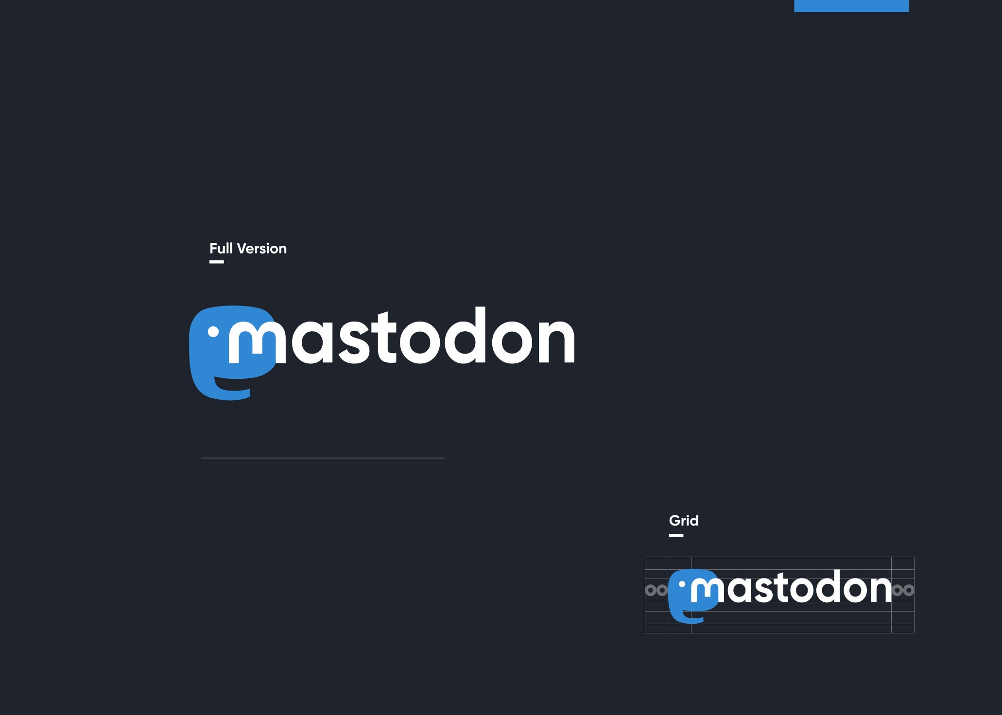
The Mastodon project is finally well-represented visually. I always felt like the previous logo did not do it justice. To its credit, it was both an M, and 3 sideways speech bubbles, but it did not scale well and overall it was just a circle. Now, after months of planning and weeks of back and forth with the designer, we have a distinct shape and a distinct font.
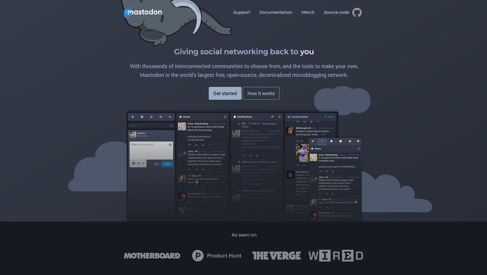
Along with the logo, we now have a beautiful homepage for the project itself. The kind of link you can send to someone to show them what Mastodon is without committing to any particular instance — joinmastodon.org
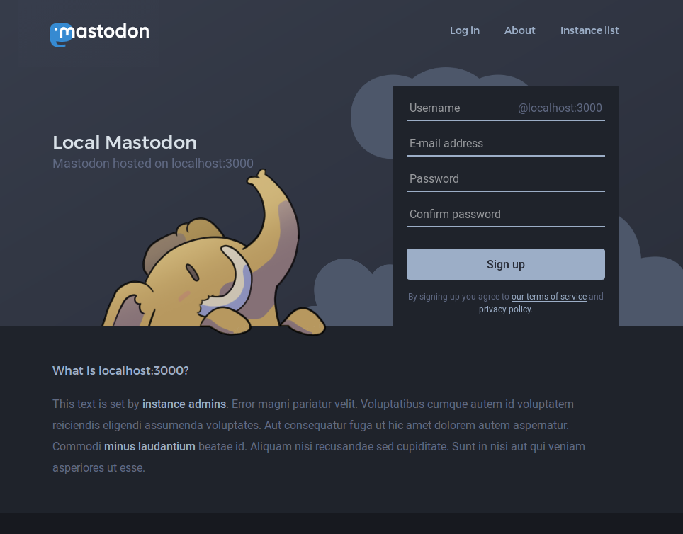
And as all good things come in threes, the landing page distributed along with the software itself — the instance frontpage if you will — has also been refurbished. Now that there is a project homepage to differentiate itself, the instance frontpage puts more effort into presenting a particular instance’s identity, rather than the underlying software. The name and the customizable description have a lot more prominence.
And something that’s been requested since literally day one of the project is finally here too — the frontpage now features a preview of the public timeline (“firehose”, if you will) of the instance, thereby letting you get a taste of what’s inside this hip new social network. Though instances that prefer to stay mysterious can still opt-out of that new feature.
All of the above comes bundled in our 1.5 release. But that’s just the tip of the iceberg. The other cool stuff can be classified into five main categories: quality of life improvements, admin features, mobile experience and accessibility, and other.
Quality of Life improvements:
- Previous behaviour of “content warning” and “media sensitivity” being completely separate was confusing to most. This has been simplified. Media can be sensitive without hiding the text, but hiding the text with a content warning will now always hide the media, too.
- A new preference setting to always pre-mark media as sensitive on your account.
- A new preference setting to opt your public profile out of search engine indexing.
- A new preference setting to have the web UI displayed using your operating system’s native font instead of Roboto.
- When editing your profile, you now get a preview of your avatar and header. The operating system’s “no file selected” label on file inputs confused people.
- The muting feature has been adjusted. Previously it was meant only to hide someone’s toots from timelines, not to hide them from your notifications (e.g. you’d mute a friend who is annoying in general but you want to hear from when they’re talking to you). By popular demand this has been changed to block notifications, too, essentially becoming a stealth-block.
- The overview of active sessions is now a lot more accurate, and you can now revoke a session.
- The disparity between toots/following/follower numbers on the local instance vs user’s origin instance was also confusing. There was an asterisk next to the numbers with a disclaimer that they may not be accurate, but it was way too invisible. Now, profiles of users who originate from a different instance display a prominent disclaimer with a link to view the full profile.
- The character counter now ignores the domain part of user handles, and treats all links as 23 characters long, regardless of how long they are. This removes the unfair penalty of users whose domain is longer, and allows you to not worry about the length of the URLs you are sharing, since they get shortened visually anyway.
Mobile experience and accessibility:
- We now have Web Push notifications. It is a method of sending notifications directly to the browser, without having to use a native app (opt-in, of course). It is a relatively new web standard, which more and more browsers are implementing and it blurs the line between mobile website and native app.
- The swiping gestures have not only been adjusted to be less sensitive, but are now accompanied by visual feedback — no more accidental swiping between columns.
- Another feature making use of an upcoming web standard, which is a bit newer and may not be available in any browsers yet, is the “share” button, which acts like the “share” feature of native apps.
- All dropdown menus now open as modal windows on mobile, making it much easier to hit the right item.
- Multiple accessibility improvements — too many to list here, but including improved contrasts, screen reader support, and keyboard access.
Admin features:
- Admins will now receive immediate e-mail notifications about new reports.
- For troubleshooting, admins now have a button to re-subscribe to accounts from a particular domain.
- Added a domain block option that does nothing but reject local cache of media files.
- The contents of the /terms page can now be customized entirely if you want a different privacy policy than the default one.
Other:
I have previously mentioned that Mastodon is looking to implement a newer federation protocol, ActivityPub, to replace OStatus in the very long term. This protocol itself is a work in progress incredibly close to being done, and I’m working closely with the W3C working group responsible to make sure the needs of the Mastodon project are well met, along with many other developers.
The implementation of a completely new underlying protocol in Mastodon is not easy. It has been an ongoing effort for a couple months, and it is split into stages. With this release, one stage of the implementation is ready — ActivityPub-compatible representations of public data. This is just a first step, but I’m proud of it anyway.
The fight for an ethical, decentralized internet is not over. We have made a significant impact in April, we’ve gotten big in Japan, but we need to keep going! We need a couple more months like April to cement our position in the public perception, to nurture the idea that no, you don’t have to just succumb to surveillance capitalism to hang out with friends and reach an audience. I truly hope that this release is another step in the right direction, in making it easier to convince people to use Mastodon.
I want to conclude this post by giving shout-outs to the people who make the development of this project possible — my patrons. Likewise, to Sorin Davidoi for implementing a huge chunk of the mobile experience improvements. To Dopatwo, for providing me with a steady supply of adorable elephant friends, and to Jin Nguyen, who designed our new logo.