Mastodon branding updates
We're going purple

Eugen Rochko
Strategy & Product Advisor, Founder
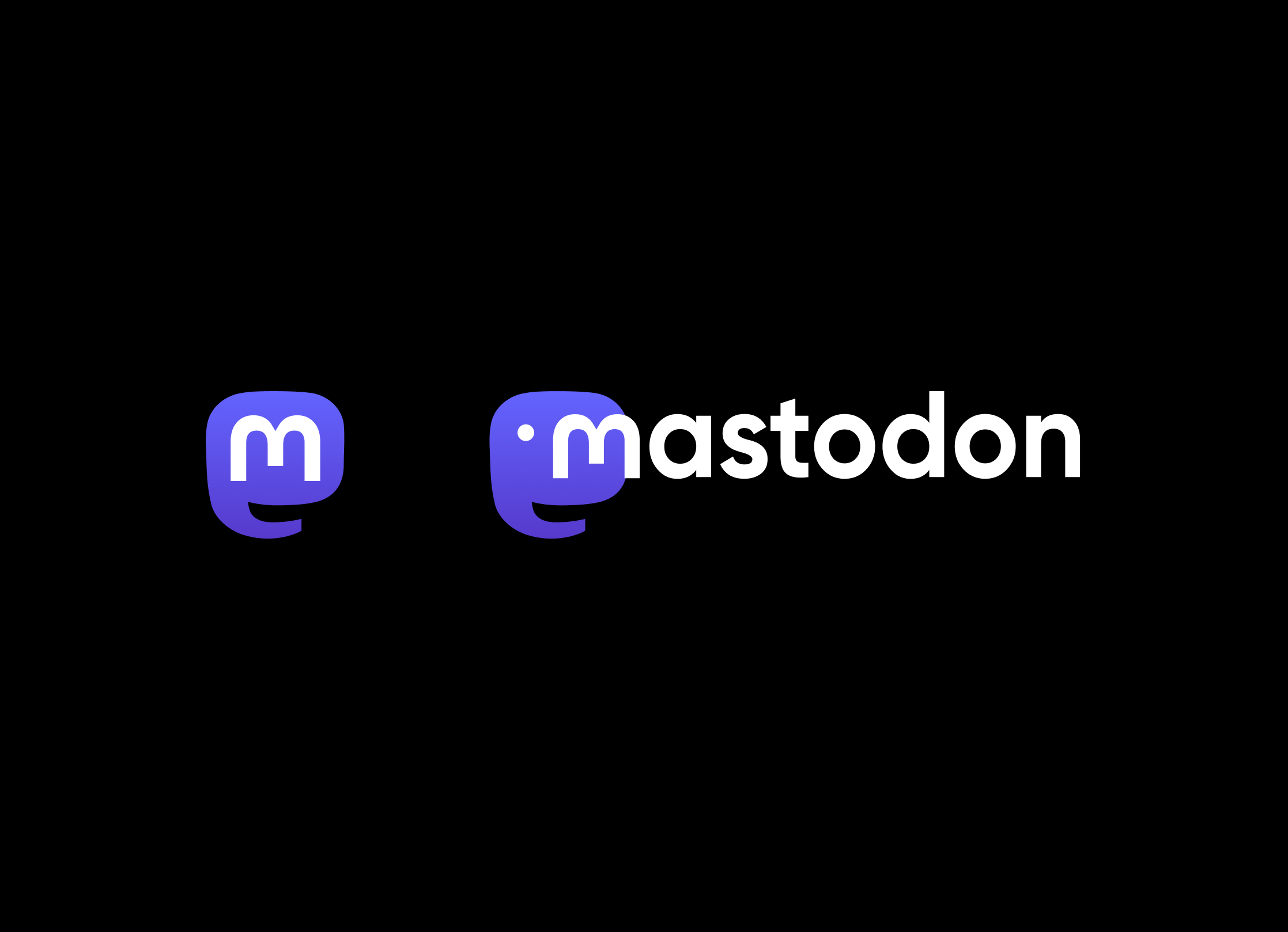
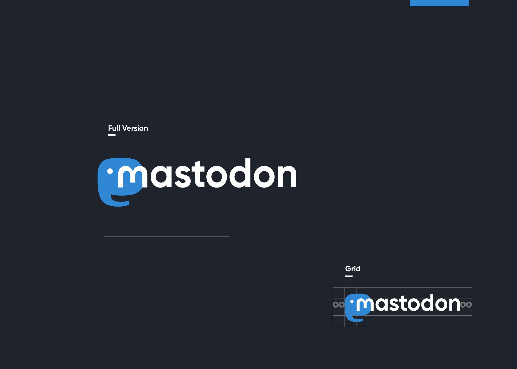
We’re teaming up with the design agency Oak to update our homepage and our brand. We’re leaving the ubiquitous blue that every social app seems to have behind in favour of a vibrant purple. Our logo also gets some subtle shape fixes that makes it look more precise.
I originally picked our color palette from a color palette website back in 2016 when I needed something for the interface of my then-hobby project, because it looked nice enough. No deeper thought went into it, and eventually the blue shade of the palette became part of the Mastodon logo.
The new color will give Mastodon some original personality and it will stand out more from competitors, who all use blue.
As for the homepage, our intent is to give it a professional touch and improve how well it communicates what Mastodon is. joinmastodon.org is the face of the software and of the segment of the federated network that is powered by Mastodon, and as such, I believe that a higher quality website will improve public perception of the entire project.
Oak has generously provided a discount on services rendered as a form of sponsorship. We’re about a month in on the work and expect to complete the new website in about two more months.
As for the brand updates, they will be rolled out gradually as we update multiple independent properties–the software itself, the iOS app, the Android app, the homepage, the documentation, this blog… So do not be alarmed if you do not see the purple everywhere at the same time.