New website launch
joinmastodon.org has never looked nicer

Eugen Rochko
Strategy & Product Advisor, Founder

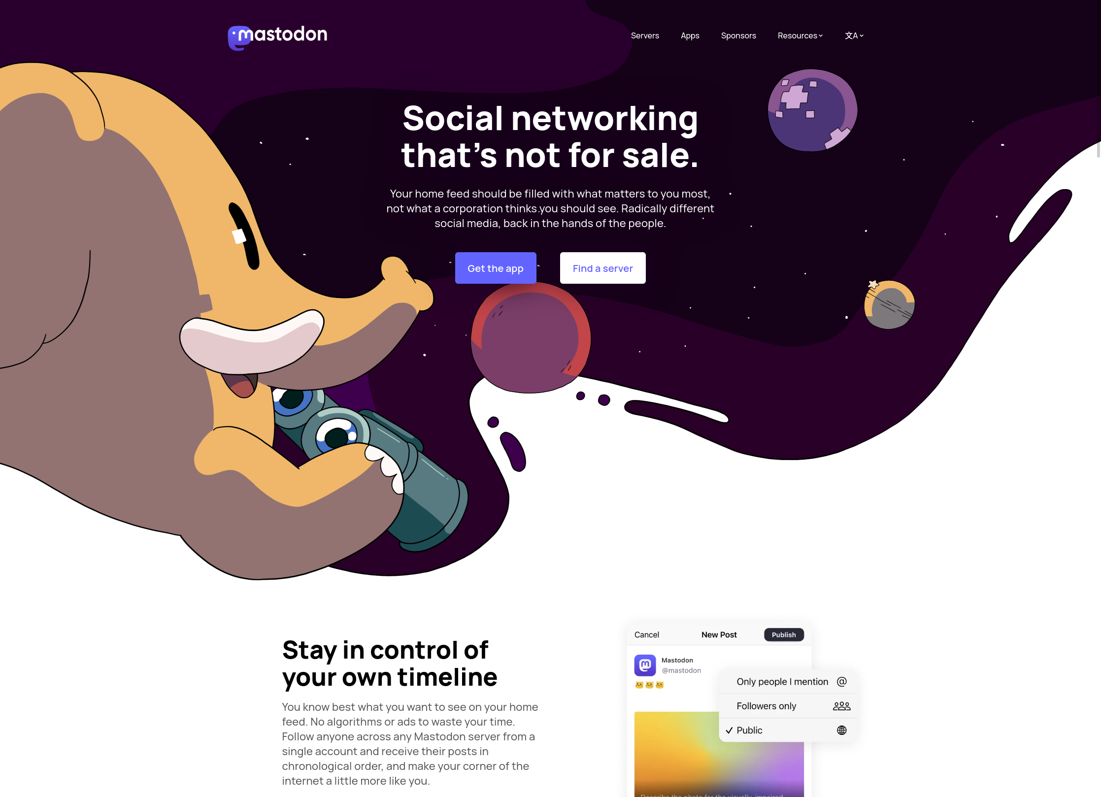
I’m pleased to announce that our new joinmastodon.org website is now live. We teamed up with the design agency Oak to give our project a modern and professional presence. The website is responsible for explaining what Mastodon is, why it is better than other social media platforms, what makes it unique, and how to get started, and I believe that it has never been as good at those things as it is now.
When writing the copy, I focused on the angles that seemed to resonate with people the most on our social media, and tried to pre-empt common misconceptions about the fundamental workings of Mastodon.
Leaning a little too hard into the community and theme-focused server angle in the previous website iteration seemed to lead a lot of people into believing that Mastodon servers were insulated from each other like mere chatrooms or subreddits. While undoubtedly useful for some, that is a lot less unique and exciting than the reality, that Mastodon’s fundamental value-add is being able to follow users from other Mastodon servers and even other compatible software and receive their posts in your home feed from just one account.
Besides explaining Mastodon in a much better way, the new website also provides more information about the project than before. You will find a summary of the project’s origins, our up-to-date numbers, who’s on the team, links to our annual reports and podcast interviews we’ve done on the About Us page, as well as much clearer contact instructions. I’m equally proud of the Branding page, which should ensure much more professional representation of our project in the press.
I hope the new website will help more people understand and become interested in decentralized social media and what it can do for them. And just plain look nicer!

